My community of Tucson, Arizona just experienced the hottest August on record.
Tucson is also the third fastest warming city in the U.S.. Such warming is happening around the world due to the local heat-island effect and global climate change. But we can help address both by growing carbon-sequestering air conditioners in the form of multi-use native vegetation that can reduce urban temperatures by over 10˚ F degrees in its shade.
The more we harvest, rather than drain, rainwater and stormwater to freely irrigate that vegetation; the larger and healthier it grows, resulting in magnified cooling. This cooling is not just from shade, but is also due to the evaporative cooling effect of the transpiring vegetation. Thus, the more we can hold on to rain when it falls (within water-harvesting earthworks or rain gardens), and extend its availability long into the hot, dry times—the more powerful the cooling effect of the associated vegetation.
Mapping tools can quickly show us stormwater flows, where we are doing well with vegetation, where we can do better, and the result of efforts over time.
The following describes a Pima Association of Governments (PAG) mapping tool that is only for Pima County, Arizona. But other counties and municipalities may have similar mapping tools.
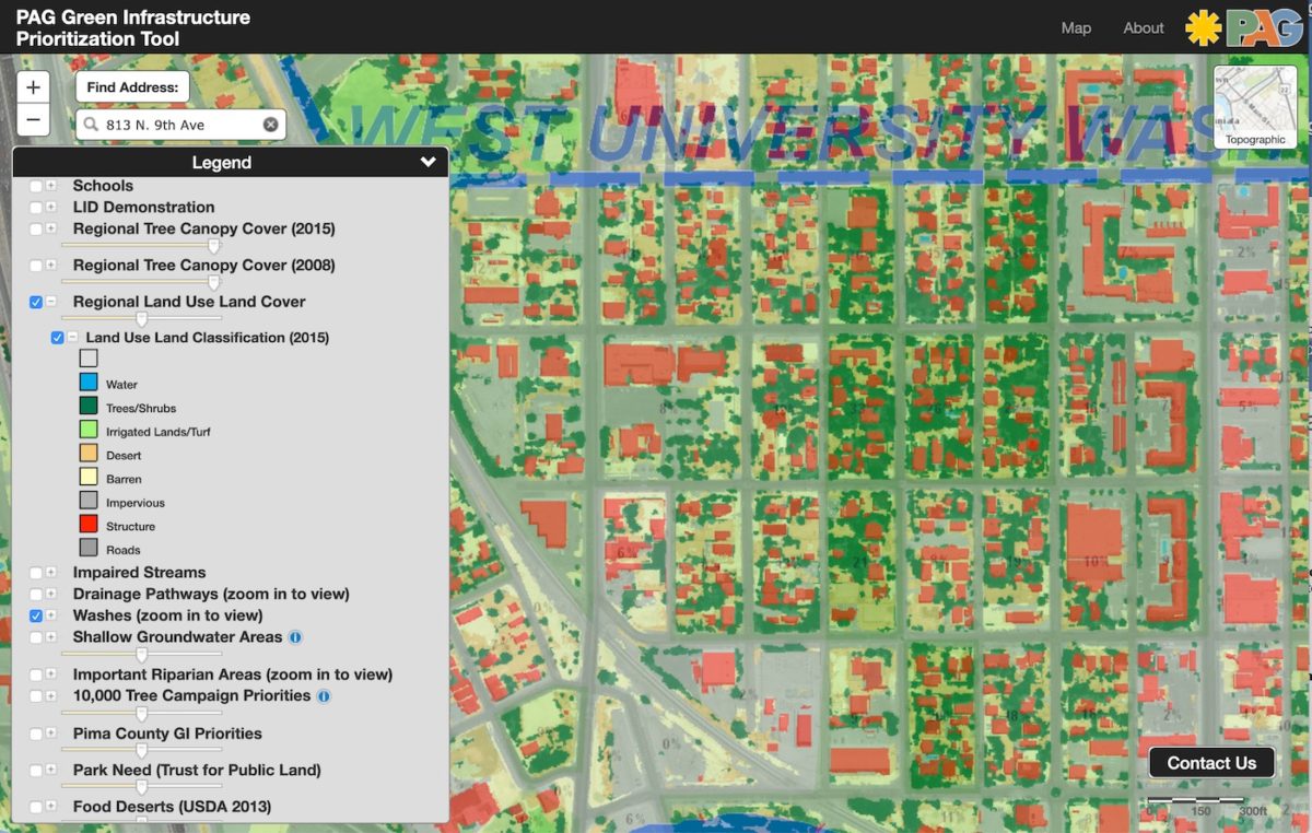
1. Online go to the PAG Green Infrastructure Prioritization Tool map (https://gismaps.pagnet.org/PAG-GIMap/map.aspx) and plug in your address. Then expand the view to include your entire neighborhood.
If the map is not working for you, try viewing it on a different web browser.
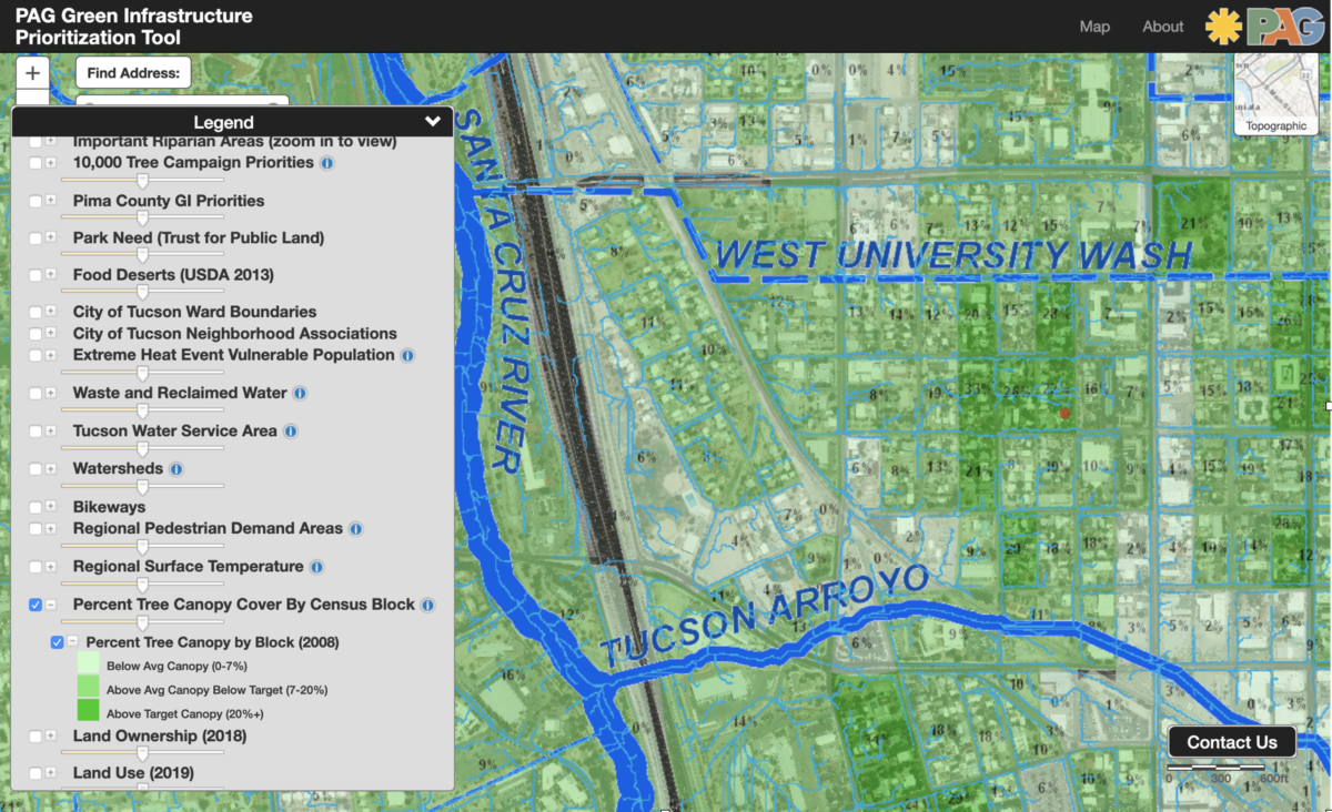
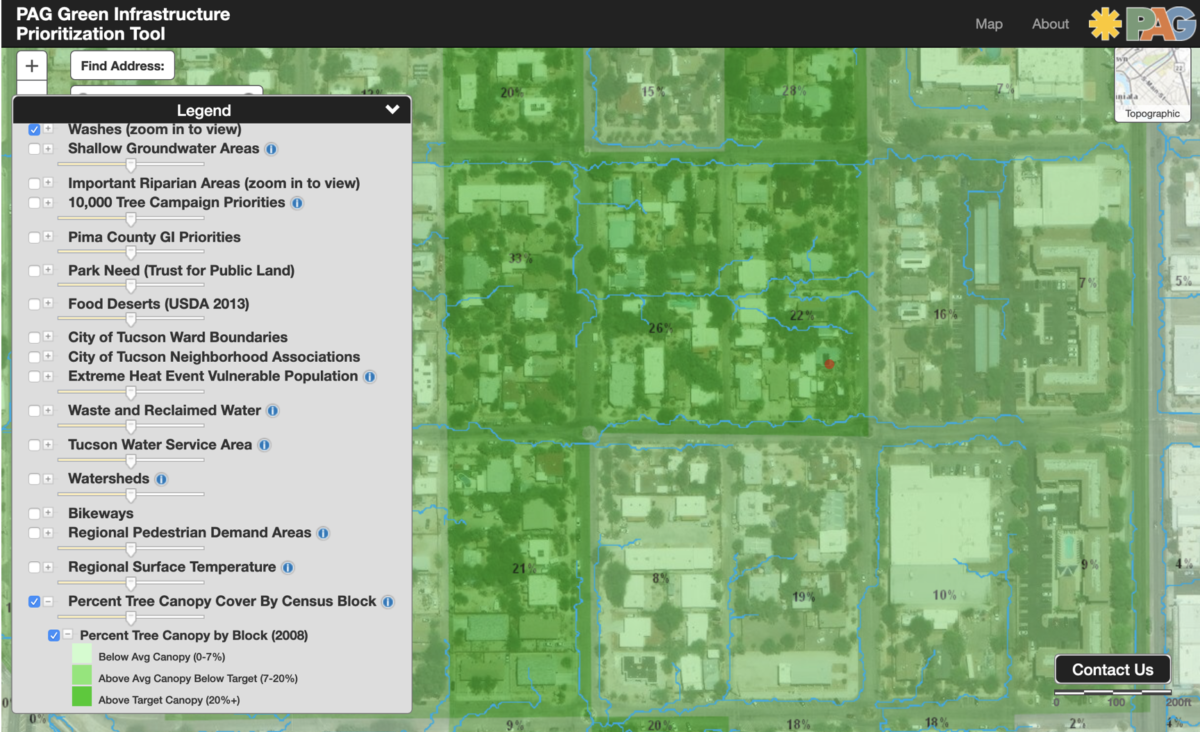
2. Click on/open the Legend (lower left corner of screen). Once the legend is open, click on/choose the boxes for the following layers to be added to the map (figure 1):
• Drainage Pathways – then its Flowline sub-box
• Percent Tree Canopy Cover by Census Block
• Washes
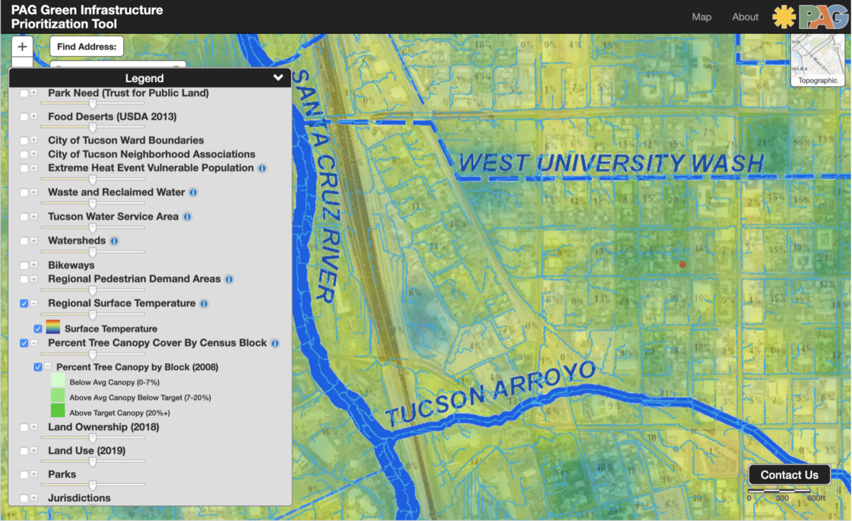
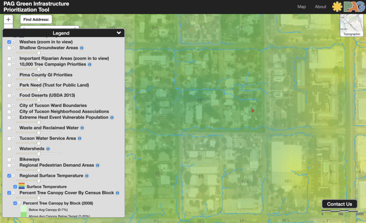
3. Within the legend, click on the Regional Surface Temperature layer
This will show you the hotter and cooler areas based on year 2008 data.
The more yellow to orange—the hotter the temperatures.
The more green to blue—the lower the temperatures.
4. Within the legend, click on the Regional Land Use Land Cover layer
This will show you various hardscapes from which stormwater runs off, vegetated areas that could harvest that runoff, and unpaved areas that could be planted with stormwater and vegetation.
5. Take a screen shots of the map for your records..
On my Mac computer I do this by pressing the Command, Shift, and “4” keys simultaneously. A plus symbol then appears on my screen. With my mouse or trackpad, I move the plus symbol to the perimeter of the area I want to capture in the screenshot. I then click and hold, a rectangle appears which I can expand or shrink as I move my cursor. When I release the click on my mouse or trackpad, the screen shot is taken.
6. Request PAG to fund and upload Percent Tree Canopy Cover data and Regional Surface Temperature data at least every ten years to the mapping tool.
Since the data currently available on the mapping tool is from 2008, it would be great to have updates at least every 10 years to be able to compare, see how we are doing, and the effects of ongoing work.